


A Discussion of Statistical Anomalies in the 2024 Election in Texas
(It’s bad, y’all)

Fraudulent data in the Texas 2024 election is so simple that once it’s pointed out it seems obvious. The fact that we haven’t reached a mainstream consensus is as much an indictment of our press, our education system and our dedication to asking the important questions, as it is an indictment of those who manipulated our elections.
Travis County
When I was asked to look at Travis County, I initially thought I would find no signs of interference. The Austin area is home to so many educated individuals that surely enough of us would have looked diligently and published any evidence of malfeasance. But either we did not look, or did not know what to look for, or our concerns were stifled while the crimes continued.
All analysis of Travis county uses data from Election Night Reporting. This is not a government site, but it is the site linked by the Travis County Clerk. If you are uncomfortable with the implications of our official election data being warehoused by an organization using a .com web address, good. So am I.
Voter Turnout
The evidence is so clear, it shows up in Travis County’s turnout data, before we even consider partisan factors.

This chart stacks different vote types for each precinct. The vote types are layered from least (mail, then election-day) to greatest (early voting). Then the precincts are ordered from lowest total turnout on the left, to highest total turnout on the right (It’s not possible to label all 287 precincts in print). This makes it obvious that mail and election day voting were fairly consistent, while early voting changed the most.
Nothing obviously strange so far. But notice that both mail-in and election day ballots show some spikes. The tallest, narrowest spike in mail happens just right of the midpoint, where turnout is 65%, and since election day turnout in that precinct was pretty average, the spike in mail “shows through” the top of the election day votes. The next largest spike in mail lifts the total with election day votes as well, just not as much. And so does the next largest spike after that.
Likewise, election day voting shows a spike just left of center, where turnout is about 61%, and then three or four other spikes elsewhere. Some of these come from surges in mail, some from surges in election day voting.
But none of those raises the topmost surface.
Model vs Actual
That’s not actually that strange. I’ve sorted from lowest total turnout, to highest. Any local spikes would just be smoothed away, or show as a sudden rise, right?
Well, sort of. Because that total turnout is surprisingly smooth and flat. What should it look like?
Travis County reported an average voter turnout of 63.41%, with a standard deviation of 10.45% across all precincts. If we use that to generate a bell curve, we see this:

Not a terrible match. Real data is messy, so the variation around the expected bell curve is mostly normal. The spikes at 61% and 74% look a little high, though. And the way the turnout just *stops* at 81% may be a little suspicious, too.
When we take the predictions of that model bell curve and chart them as individual “precincts” matching our original turnout graph we see:

Possibly the trend in turnout can be explained by the underlying voter and ballot counts?

Not in any obvious way. In fact, the section of highest turnout (where actual vote counts differ from the bell curve model) looks different, here, as well.
So initially, it seems possible that votes may be missing above 75% turnout, or else votes were added in a way that raised average turnout.
Where should we look for these mismatches? Our first chart shows that mail and election day were relatively constant across precincts, and that they were a minority of ballots cast. That leaves early votes as the likely culprit.

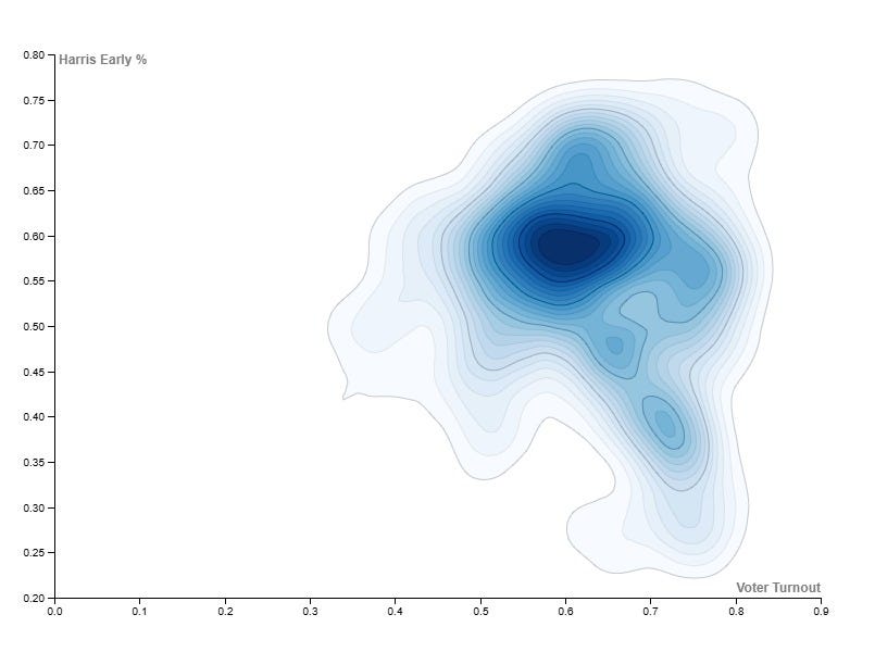
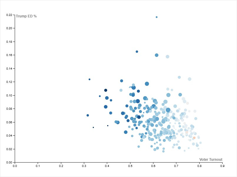
With more resolution into voter turnout, almost all of the systematic variance comes from early voting, with Trump’s performance across precincts varying slightly more than Harris.
Harris clearly leads Trump in precincts with less than 65% turnout. But Trump appears to have an advantage in precincts with turnout above 65%. And again, by strange coincidence, that volatility appears to calm above about 75% turnout.
It seems like there’s something unusual in the span above 65% turnout.
Statistical Insight
Shpilkin, Klimek & Sobyanin-Sukhovolsky Methods
The Radio Free Europe article “The Russian Tail: How Data Could Reveal Georgian Election Fraud” details statistical methods developed by Sergei Shpilkin and others, to investigate Russian interference in European elections. The PNAS article “Statistical detection of systematic election irregularities” details a similar approach developed by Peter Klimek, et al. Both methods make the basic assumption that most vote distributions will be somewhat Gaussian, either in regards to turnout, or else regarding the candidates’ percent returns. In either case, deviations from the standard bell curve are potentially suspicious and merit deeper investigation.
What do we find in Travis County? First, the charts that scale as turnout:
Turnout Percentage vs Votes
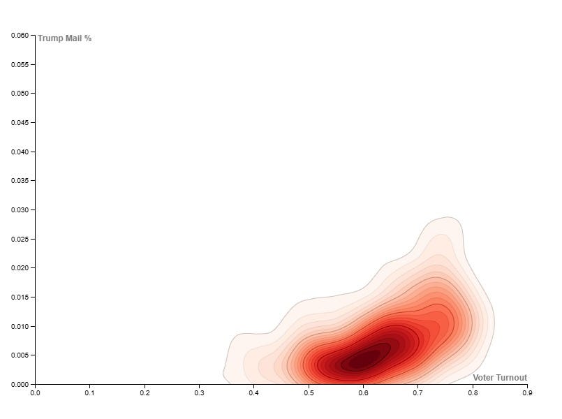
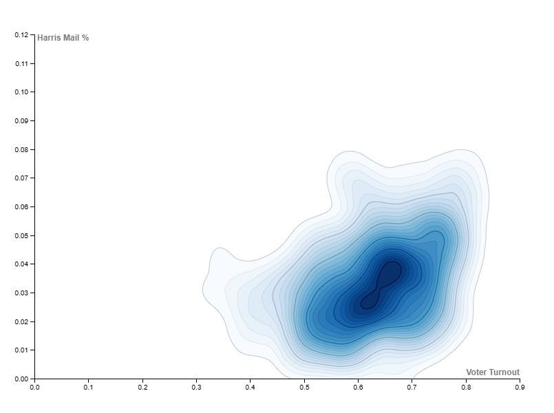
Mail-In Ballots

And Klimek heat maps for mail-in ballots:
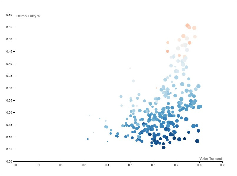
Combined in a bubble chart:
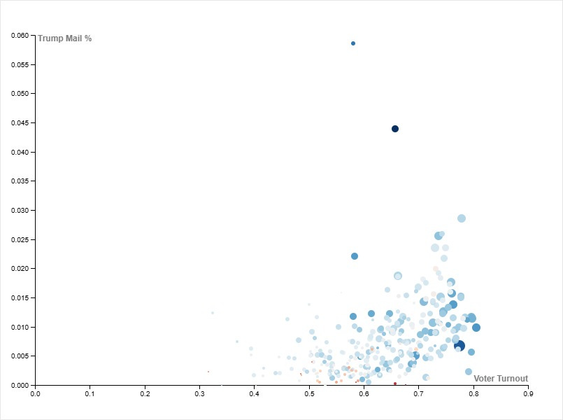
Mail-in ballots are believed to be the most secure and reliable form of voting (at least once they are delivered). At that point, physical, legible ballots are counted and warehoused. We can take the vertical measurements of these charts as accurate representations of the candidates’ relative performance, and because the horizontal axis is scaled by the total turnout it should likewise be consistent across this analysis.
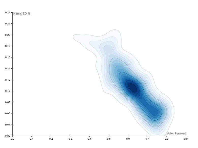
Early Voting
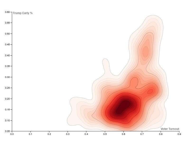
Here are the same charts for early voting. Note the spike at 61% turnout, and the non-Gaussian distribution. Shpilkin & Klimek both warn that these are both signs deeper analysis is needed. Remember that because turnout includes all candidates, a spike doesn’t necessarily mean fraud by one candidate in particular, nor in any particular set of votes.

Klimek heat maps for early voting:
Per the Klimek paper, this smearing up and right suggests ballot stuffing for Trump, and is reflected in Harris’ numbers smearing down and right. And joined as a bubble chart, we can see that Trump votes appear to be shearing affected districts up and away from the more Gaussian mainstream.
Combined in a bubble chart:
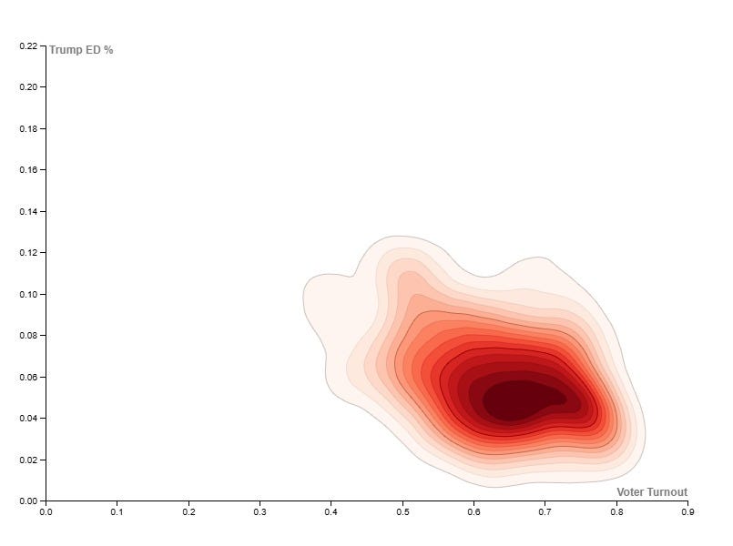
Election Day
And considering election day, we see more non-Gaussian forms and another spike at 61%:

Klimek heat maps for election day:
This mismatch is almost certainly an artifact of all charts sharing the same total turnout as the horizontal axis. In other words, the early vote ballot stuffing appears to have been so severe that it even skewed Harris’s election day results. This offers a helpful index of exactly which precincts had fraudulent votes added for Trump: any precinct where Harris’s election day performance was less than about 8% of the total cast in that precinct, is suspect. Obviously, these would be precincts where Trump’s net performance was already sufficient to disguise any additional votes. By happy coincidence, these are also 78% of the precincts with turnout above 65%.
Combined in a bubble chart:
Precincts per Candidate Percentage
We can better see the non-Gaussian irregularities in the early votes if we use the second method from the article covering Shpilkin; the Sobyanin-Sukhovolsky method accumulates precincts for each percentile for the candidates:
Mail-In Ballots

Early Voting

Election Day

Mail and election day outcomes resemble each other, with most precincts assigning obviously fewer votes to Trump than to Harris. This can be read as a firm and deliberate rebuke of Trump, while precincts are a little less decisive about Harris. But the early vote shows signs of the so-called “Russian Tail” - a statistical signature of interference, mentioned in the Radio Free Europe article.
With sufficient turnout, we expect these charts to be symmetrical. For example, at 100% turnout, a peak for one candidate would have a matching peak for the opponent, at 0%. Similarly, at 50% turnout, a peak at 33% would be mirrored with an opponent peak at 17%.
We certainly see that above: Harris’ peaks near 58% are reflected by Trump peaks in the high teens. What’s odd is that where Harris shows a sudden drop near 63%, Trump’s vote form does not mirror this dropoff near 12%. Instead, it protrudes leftward and then drops even more suddenly. Both the Harris drop and the Trump extension are suspicious.
This is one version of the so-called “Russian Tail”, signalling interference. Although Trump lost in Travis county, he apparently won across Texas as a whole. This is exactly the sort of victory where it would make sense to skim a few votes here or there, in regions where the candidate was less popular.
Hypothetical: Purging Suspicious Votes
Math is no substitute for a manual audit. But taking all these observations together, we can make a crude estimate of what the election could have looked like without these non-gaussian tails.
These analyses point to precincts with between 65% and 75%, where Trump did better than 25% total, and where Harris accumulated less than 8% of the vote. Unsurprisingly, there’s a heavy overlap among these sets of precincts. If we artificially cap Trump’s returns at 25% in these places, we see:


Clearly, these are somewhat a product of assuming our model is correct, that the race should have adhered to a normal distribution. But they give useful information about the number of votes that would have to have been added for Trump. Travis County reported 587,090 ballots counted, and these assume only 556,354 - a difference of about 30,000 votes, about 5 - 6%.
Given that Trump’s margin of victory exceeded 14% statewide, it seems unlikely that this degree of fraud could have shifted the state, even if carried out in every major city. However, nothing in this analysis of Travis County guarantees that this was the worst manipulation of the election, nor even that it was the only manipulation.
A manual audit, counting each ballot by hand, would be the only way to make sure.
Travis County, Observations
Several observations coincide here.
An unusual number of votes seem to have been cast in precincts with between 60.5% and 61.5% turnout.
Comparing the different ways that votes were cast, 65% turnout marks the point where precincts with very similar turnout can have very different balances of votes cast between the two major party candidates for president.
This volatility appears to diminish when turnout passes 75%.
This volatility is accompanied by non-Gaussian extensions to Trump & Harris votes.
In early voting, these non-Gaussian extensions correlate to Harris winning less than 50%, and Trump winning more than 25%.
Sobyanin-Sukhovolsky charts also show that Trump’s early vote performance between 10%-15% does not mirror Harris’s performance between 65% & 70%. At the very least, this indicates that voters were making a decision other than voting for one or the other.
Klimek charts for election day are somewhat confusing, the Harris heat map shows a down-right smearing, suggesting votes were added to Trump, but Trump’s heat map shows no matching smear on election day. This casts more doubt on the early vote.
Assuming the election actually followed a normal “bell curve” distribution suggests approximately 30,000 ballots were added or altered in Travis County.
For a candidate who won the state with a margin of 14%, rigging one blue city by a paltry 5% seems like a large risk for little return. It’s therefore likely that, if these statistics represent fraud, they should be investigated in a broader context. Only a manual recount will settle the question for sure.
Although I have limited this discussion to the race for president, analysis of downballot races reveals the same patterns with alarming frequency. This directly contradicts claims that Trump was a unique candidate with unique performance.
Texas as a Hotbed of Electoral Fraud
Data from most counties (where available) often has issues that prevent easy analysis. Therefore, analysis for the state of Texas was conducted using data available at Texas Election Results. Again, this is a .com web address, but it is the site linked by the Texas Secretary of State. I remain uncomfortable with the implication that public data is being hosted privately.
Another way of searching for electoral fraud is to seek patterns within electoral data, and to screen any possible patterns for unnoticed connections. In screening electoral data from the entire state of Texas, we see several patterns that are probably innocent.
For instance, Trump outperforms senator Ted Cruz in every county in Texas. This makes sense, because by election day, presidential candidates tend to be celebrities in their own right. Looking at the same pairing between Democrats, we’re told that candidate Harris was exceptionally unpopular, so we shouldn’t be surprised that her performance lagged that of senate candidate Colin Allred.
Here’s an example of a chart showing the consistency of these trends across all 254 counties in Texas:

With dozens of races, there are hundreds of possible pairings. Usually, candidates further down the ballot earn fewer votes as they have less name recognition, and we can show these relationships are mostly as expected in Texas, in 2024.
However, adding a particular third race to the above comparison will prove that the results we were shown are nearly impossible. That race is for the Texas Railway Commission, a body responsible for the supply and transport of various natural resources around the state.
In this chart, I’ve added the major party candidates for the Texas Railroad Commission, Christi Craddick (R) and Katherine Culbert (D). Sorting by candidate Craddick’s performance highlights a surprising pattern:

Careful scrutiny shows that Trump always tops the ticket, but Craddick and Cruz change places dozens of times. By contrast, the Democrat ticket candidates hold a stable order across counties.
In order to get a better understanding of this oddity, let’s switch from percentages to actual votes in each county, and we’ll consider the differences between same-ballot candidates:

Most Texas counties have such small populations that they are dwarfed in comparison to the urban regions. But as expected, Trump always leads Cruz and Craddick and Harris and Allred always lead Culbert. Two pairs are negative, possibly indicating unpopular candidates: Harris-Allred and Cruz-Craddick. Allred was widely recognized as a possible contender against Cruz, while Harris was supposedly less popular than her rallies, lawn signs and new voter registrations would have us believe. And Ted Cruz is almost universally despised in Texas.
The positive pairings are noticeably distinct in the chart above. Lines are visibly separate for Trump-Cruz, Trump-Craddick, Harris-Culbert and Allred-Culbert.
But the negative pairings seem to track each other with surprising precision. Let’s take a closer look.

They’re very close, but Cruz does outdo Craddick sometimes.
What do those five counties have in common? Hidalgo, Webb, Cameron, Starr and El Paso counties are the Texas counties with significant urban development, along the US-Mexico border.
The small-difference counties are all sparsely populated and rural; another natural population.
And the counties where Cruz lagged Craddick are consistently the urban, suburban and exurban zones surrounding cities. This includes Travis County, already discussed as likely compromised.
These certainly seem like naturally differing populations.

That R2 value is impressive, and the “urban” counties encompass more than 76% of the voters in Texas, and more than 80% of the votes counted for Harris. I don’t see any significant patterns in political races. Many of those voters are likely commuters who used polling stations convenient to their work, so that might obscure any patterns in equipment. (A cursory examination of demographics in exurban counties seems to support this hypothesis, but building a more precise model is beyond the scope of this analysis.)
Assuming the relationship of these data is as simple and linear as it appears, the t.test function suggests these data have a probability p = 0.0000013 (just above “one in a million”) of occurring naturally without some intervening mechanism.
Conclusions
Should these data naturally correlate? As discussed, I can’t see how. We expect elections to highlight the most prominent politicians while their down-ballot peers remain undiscussed. We expect presidential candidates to outperform senators. We expect popular candidates to outperform the unpopular and unknown.
We do not expect the gap between a presidential candidate and their senatorial companion to naturally match the gap between the opposing senator and another down ballot candidate, especially when both of those relationships have been flipped from the normal order. Remember, the normal, expected ballot dropoff would have Harris outperform Allred, while Cruz would outperform Craddick. Not only do the gaps match, so do their positive/negative valence!
It’s hard to imagine how 76% of a state’s population could even cooperate to do something like that, across party lines, without any public record or communication.
Yet we are being told these are the results of a free and fair election. We already know that’s not the case, because of the various irregularities and impossibilities in Travis county.
Without making any specific accusations, I find that impossible to believe. We’ve seen the presidential race was compromised in Travis county. Additional analysis can show similar distortions up and down the ballot, consistently benefitting the Republican candidates. And now that pattern of alterations is hinted at across another 59 counties, including the cast majority of voters and people likely to vote Democrat.
As widespread as this pattern is, it’s hard to imagine that it benefited Democrat candidates. Similarly, the scale of this pattern strongly suggests that the “winning candidates needed all the help they could steal.” This is not a pattern that suggests Republicans barely cheated to secure victory in Texas; instead, this pattern suggests that Donald Trump actually lost the state of Texas by a significant margin.
Worse, the pattern of Trump leading the Republican ticket, while Harris consistently places second among Democrats, can be seen in all seven of the swing states, and several other states besides. If we understand this pattern as mechanical and imposed, in Texas, we have to suspect it was similarly imposed elsewhere.